We use Roam extensively at work and I just spent a few minutes exploring its graph view for the first time.
Our usage involves heavy use of daily notes pages, which link to other pages in the graph that might represent projects, other people, ideas, RFCs, etc.
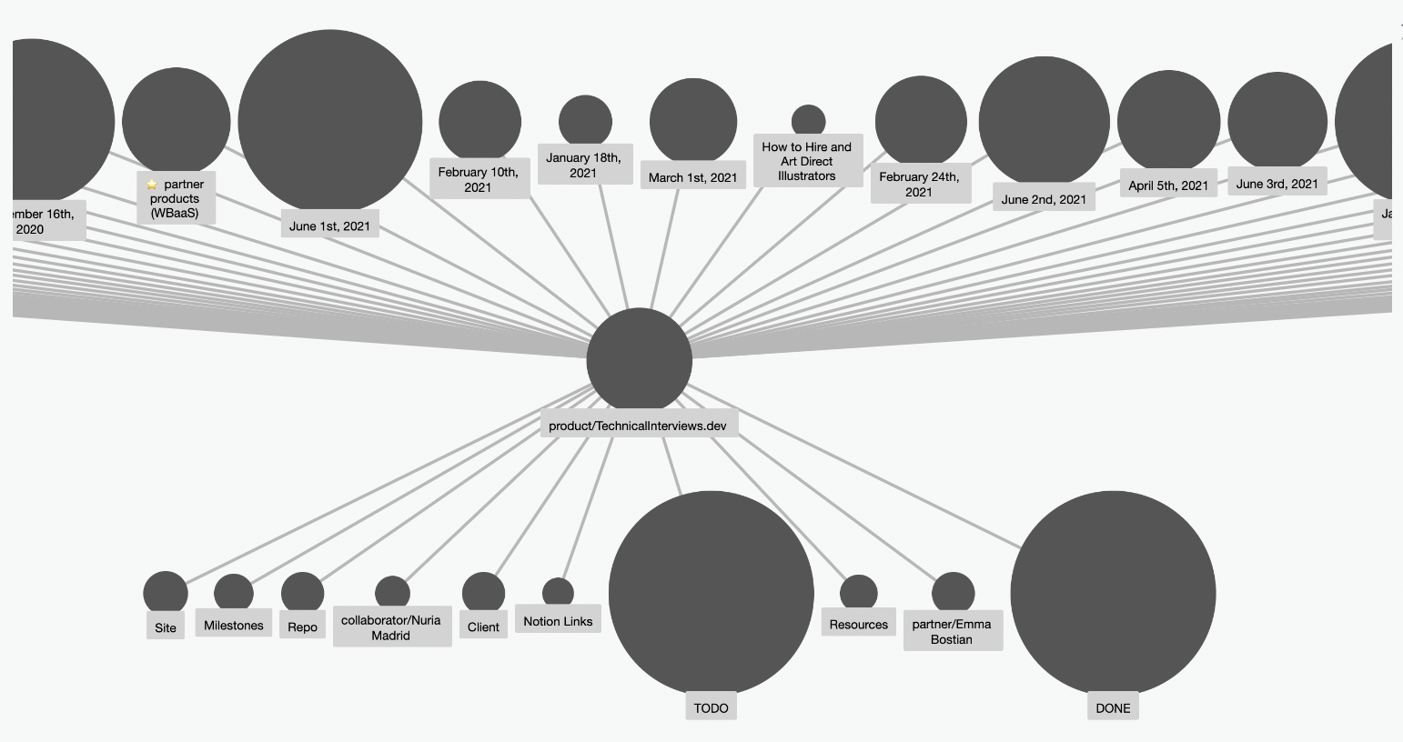
When looking at a project page in the graph, it’s easy to see a timeline of the volume of work:

(All graph views here are using the Dagre Layout.)
Zoomed in, one can see the very light hierarchy, with the project at the center and mostly daily notes pages above and subpages and metadata below:
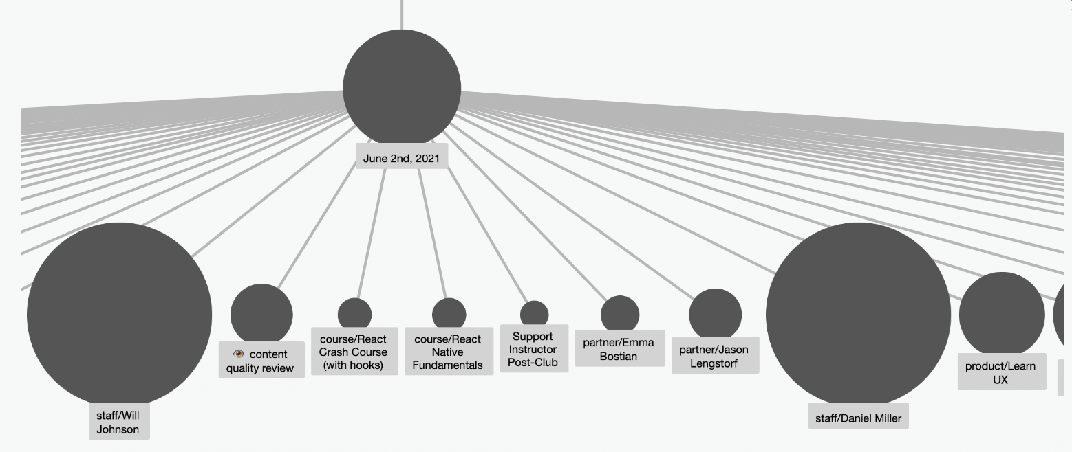
Daily notes are grouped by team member, so they are the large nodes when looking at any given daily page:

But zooming into any given day gives a quick view of what was being worked on that day:
I must admit I was resistant to Roam as a collaborative tool until we landed on this methodology revolving around the daily notes pages. Now I’m curious about how to best surface other project data I need from the graph, for example status, current owner, etc. It’s easy enough to store and view on project-specific pages, but harder to see everything in flight at once in a quickly-digestable way (and we have a lot in flight at once). For now I’m still keeping a Notion database for that at-a-glance information, but because we’re 90% in Roam (for this sort of thing), Notion gets out of date quickly.
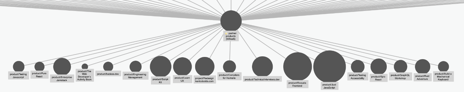
Here is a graph view from the “partner products” page:
Perhaps if I could have this view with metadata attached to the nodes (not as other nodes), and a way to more quickly get to this view without needing to navigate to the page and then having its graph jammed into my sidebar (else I could use it as an excuse to get an absurdly large monitor)… 🤔
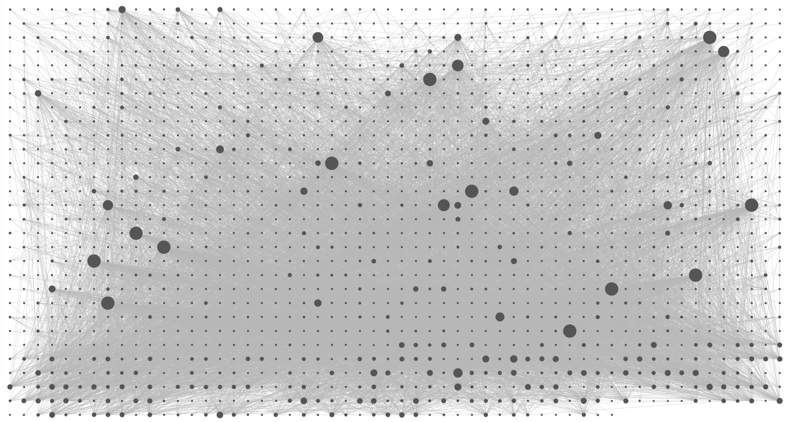
For grins, here is the complete graph without daily notes pages included:

…and with daily notes pages: